
Visual Identity Update
Free 3D Hands
This project began as an investigation into the branding of Free 3D Hands. The work involved research, consultation, and visual exploration to assess how clearly the organisation’s identity communicated its purpose.
Discovery
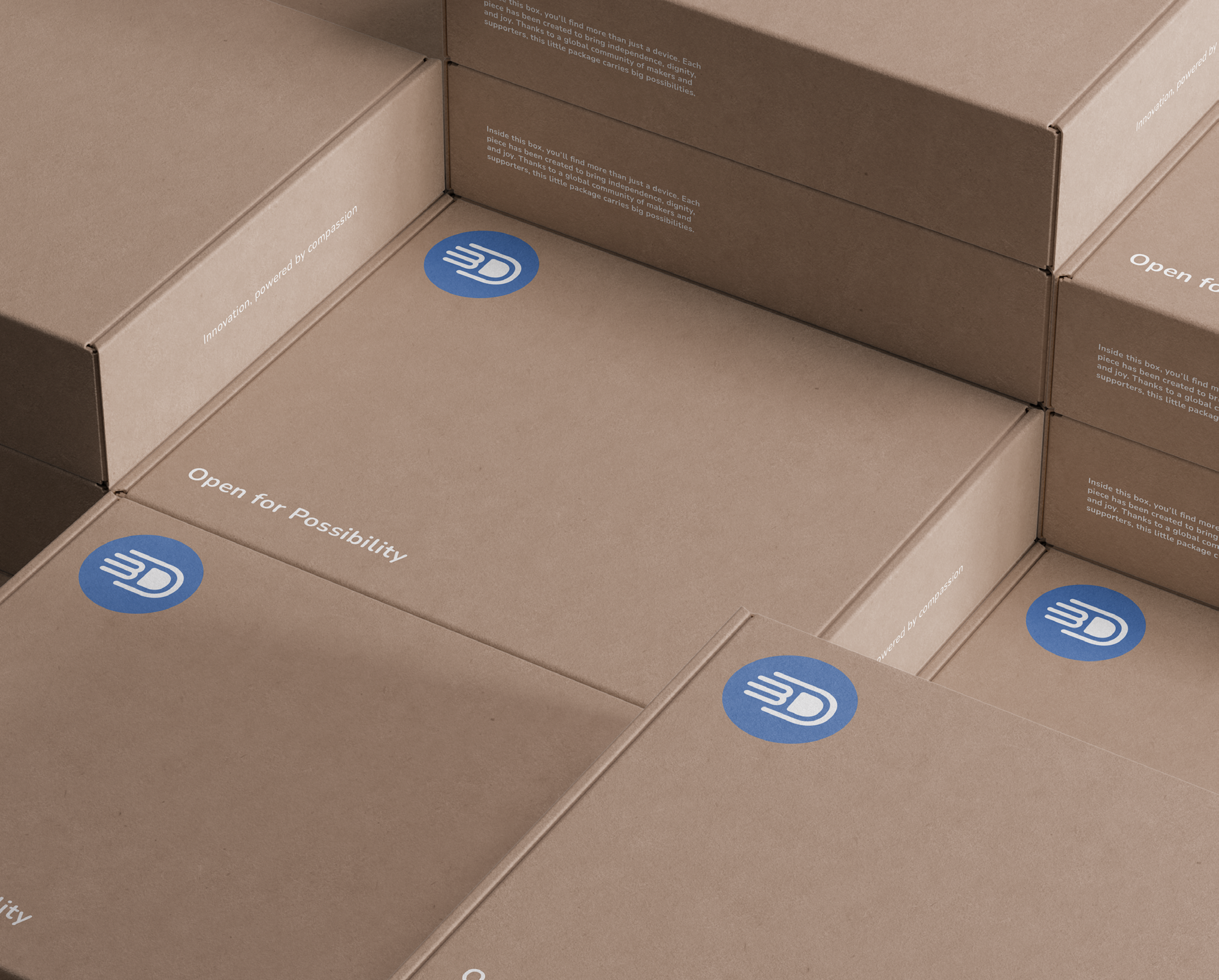
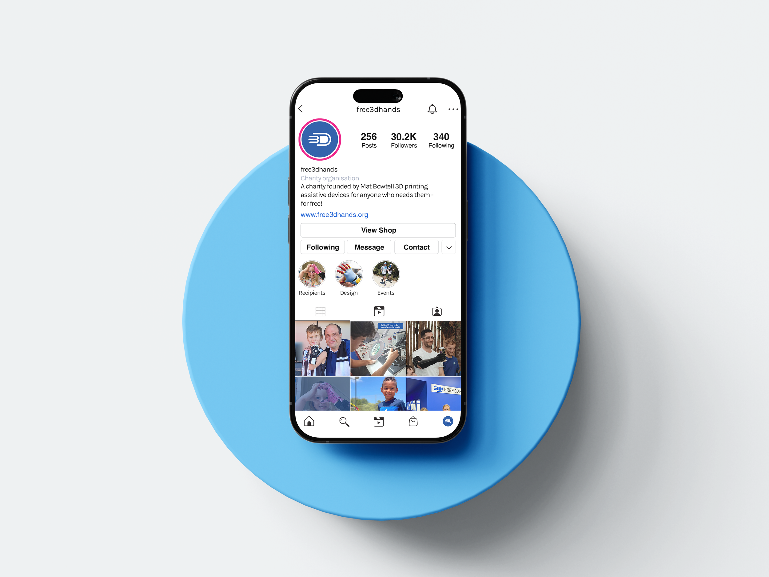
Building on these insights, the focus shifted to refining the visual identity around the existing logo. This stage involved reviewing and updating the colour palette and typography, and developing a simple, cohesive visual system that could be applied confidently across different touchpoints.
Development
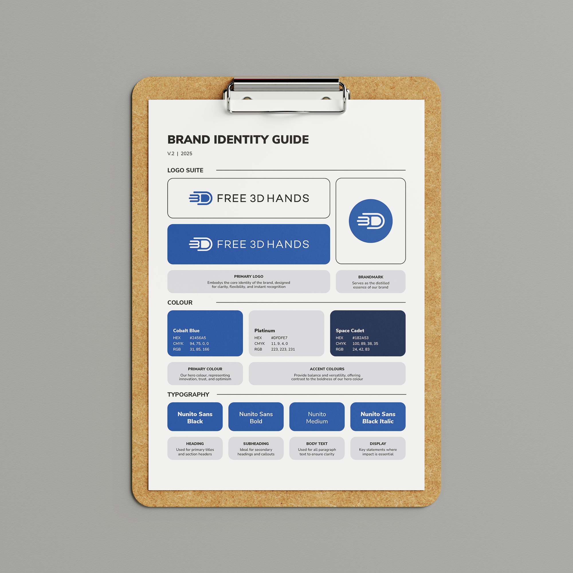
The project concluded with the creation of a short, easy-to-use brand guideline document. Designed with accessibility and everyday use in mind, the guide provides clear direction on colour and visual consistency, enabling the Free 3D Hands team to apply the brand confidently across both digital and print materials.
Delivery
“Nate has been a pleasure to work with. He supported us through the creation of our brand guide, clearly defining our brand colours, logos, imagery and overall tone. Throughout the process, he was patient, transparent about what he would deliver and clear on timelines and costs. His efficiency and approachable manner made the entire experience smooth and enjoyable. We have no hesitation in recommending Nate and will continue using his services into the future.”
Caroline Wright
Get in touch